Branding development, illustration, and packaging for an avid sailor and chemist turned winemaker.
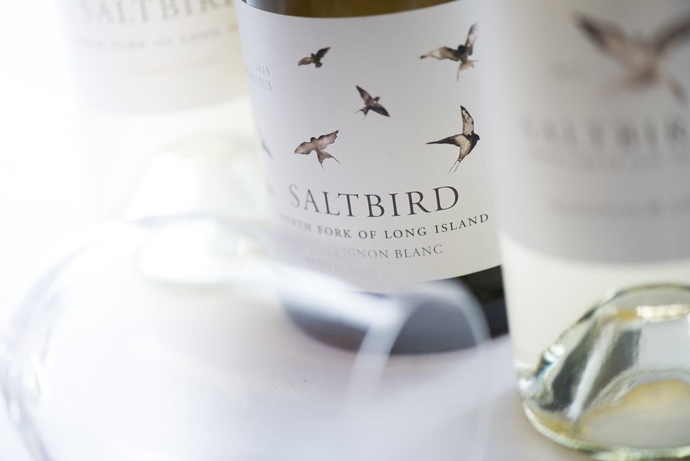
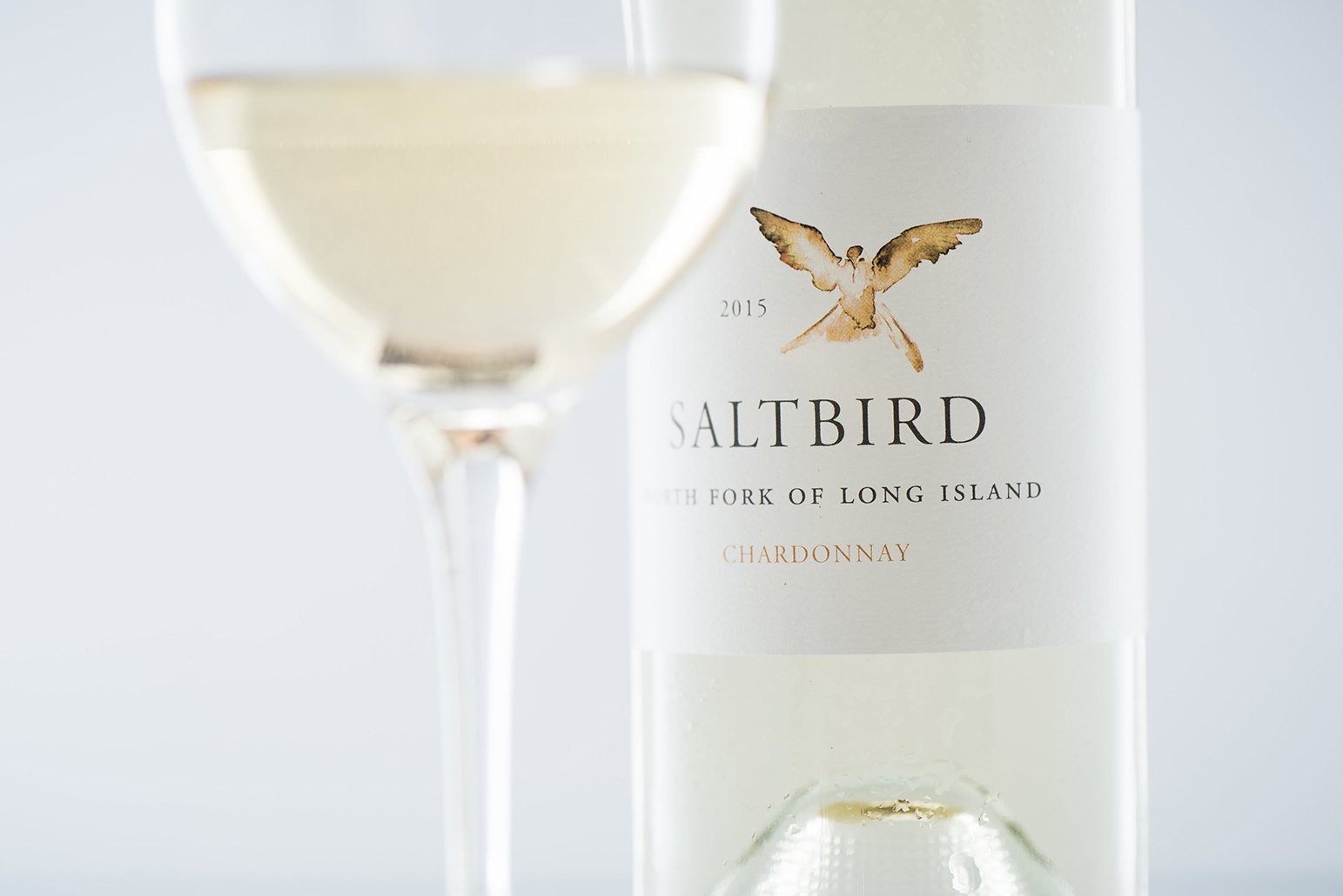
The Saltbird Cellars pictorial mark of a bird is inspired by the idea of flight and the independence it represents. The total brandmark symbolizes freedom and integrity in producing excellent wine. It is a reflection of the unique geographic location of the North Fork wine region and its connection to air and sky, water, and sea—the color choice of blue parallels the intellect and elegance of Saltbird Cellars’ winemaking. Blue is the color of the sky and sea. It is often associated with depth, stability, trust, loyalty, wisdom, confidence, and expertise.
saltbirdcellars.com

Photography by Madison Fender
David Benthal Photography

Photography by Madison Fender

David Benthal Photography