Brand design for a full-service residential architectural firm
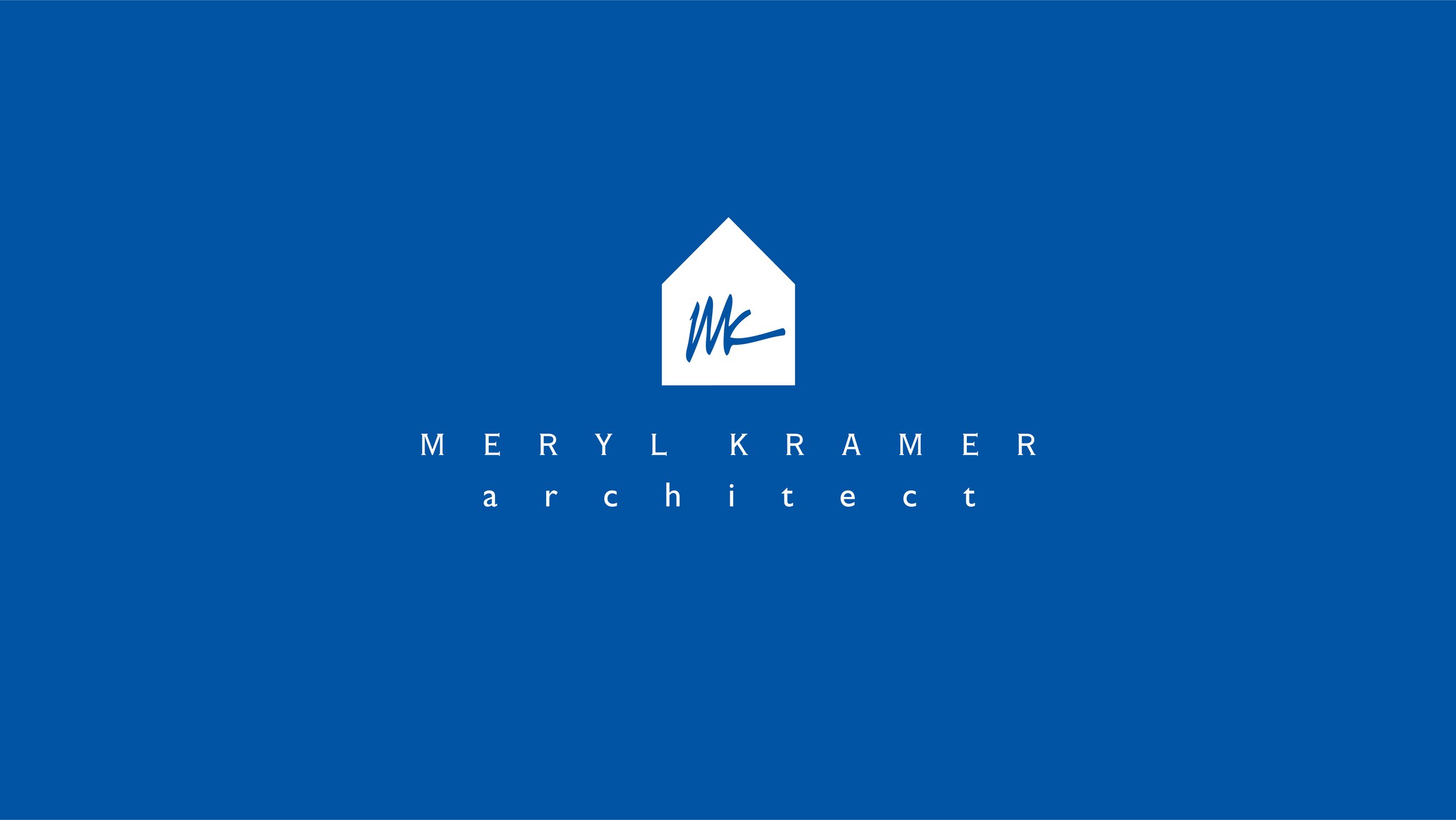
MKA’s primary design goal is to derive uncomplicated solutions that solve spatial organization problems, both from usability and visual standpoints. Meryl and I sat down and had a conversation, and from that conversation, I understood the logo needed to be visually strong and direct. I found that Copperplate Gothic was the font for the logotype, but I felt the graphic needed more as I worked through the design process. When I saw Meryl’s signature on a piece of paper, I knew I needed to incorporate it into the design. It brought a fluid line to the edges of the graphic and centrally focused the eye. This incorporation created the same personal quality and attention that MKA brings its clients.
merylkramerarchitect.com
