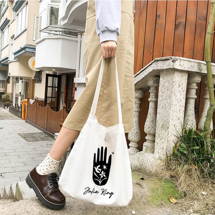
Art direction and logo design for an American singer-songwriter.
Julia King is known for her diverse songwriting style and brilliantly poetic Misfit Americana technique. There are hints of Country, Pop, R&B, Jazz, and Rock & Roll sounds that weave in and out of her writing. My goal was to create a logo that embodies Julia.
The hand that plays the music is the conceptual motivation behind the primary graphic of the logo design. The hand represents playing music and the common symbolism found throughout your music. It also means the connection to farming and a love of garden tending.
The bird represents take-off/transportation/flight. Music can lift and send someone to another place, and experiences can take many paths.
The flower signifies transformation. In one single bloom, song, or album, there are many moments it may look different—any one genre does not define you; instead, you let the chemistry of the external world and your inner world guide the music that you write—similar to soil, sunlight, and rain guides a flower’s growth.
The star is her—the bright light on the stage and lit by the stage.